1 Installation
- Firstly, you must install Prestashop version 1.7.x.
- Secondly, prepare for installing the SP Category Slider. The installation contains 4 steps as following:
Step 1: Login to your Prestashop admin panel and Go to Improve >> Modules >> Modules Services. At the top of the page, click the Upload a Module button. 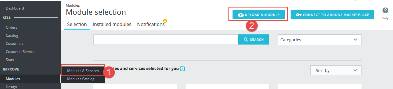
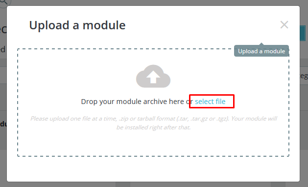
Step 2: Click “Select File” to select your module .zip file “sp_categoryslider_p1.6-res_v1.0.2.zip” that you have downloaded.
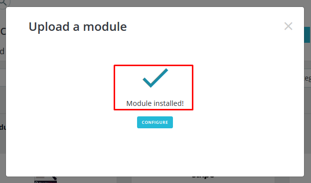
Step 3: The uploading process will be started. You will see the message that “Module installed”.
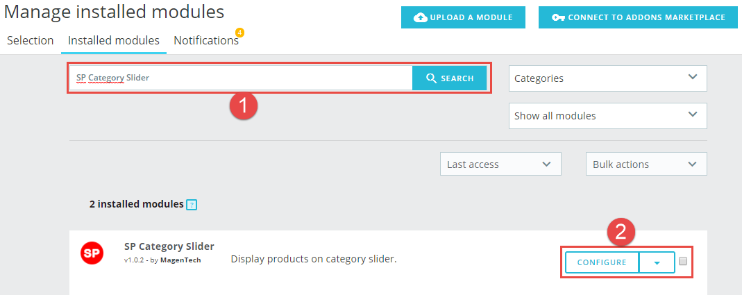
Step 4: Finally, the new module will be located in the modules list. Search the name of module and Click on the Configure button to configure the module.
2 Configuration
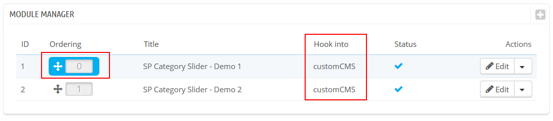
You can edit, duplicate, delete and add new module in this page.
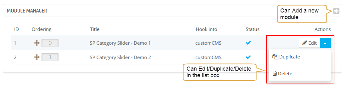
In this layout, can change ordering of category by dragging the box contain ordering. And this module can work with different Hook into, can change in the param Hook into.
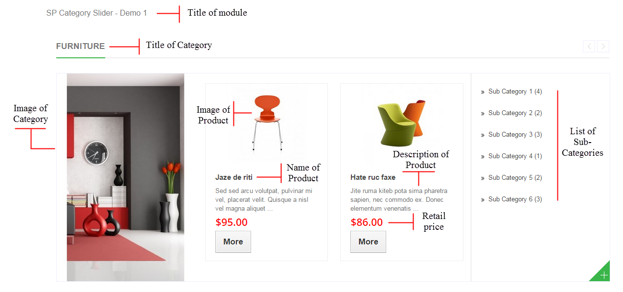
Below is module layout
The parameters are divided into the following groups:
- General Options
- Source Options
- Categories Options
- Product Options
- Effect Options
Let’s look at the parameters in detail:
General Options
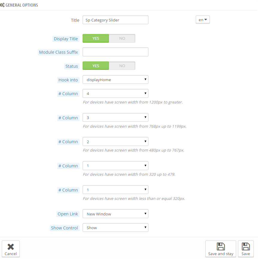
- Title – Input title for the module.
- Display Title – Display title of module Or not
- Module Class Suffix – A suffix is applied to the CSS class of module. This allows for individual module styling.
- Status – Set status enable/disable for the module
- Hook into – Select Hook into in list box
FOR PRODUCT
- # Column – Set # column for each device
- For devices have screen width from 1200px to greater.
- For devices have screen width from 768px up to 1199px.
- For devices have screen width from 480px up to 767px.
- For devices have screen width less than or equal 479px.
- Open Link – Target to open links:
- New window – Open the link in the new window/tab
- Same window – Open the link in the same window/tab
- Popup window – Open links in new pop-up window
- Show Control – Allow to show Control (Next/Prev) button Or Not
Source Options
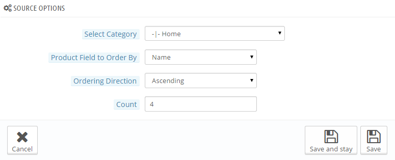
- Select Category – Allow you to select Category
- Product Field to Order by – Set Product Field to Order By: Name/ID/Date Add/Price/Sell/Position/Random.
- Ordering Direction – Allow to order ascending/descending direction for field.
- Count Product – Allow to set the number of product to be displayed in this block.
Categories Options
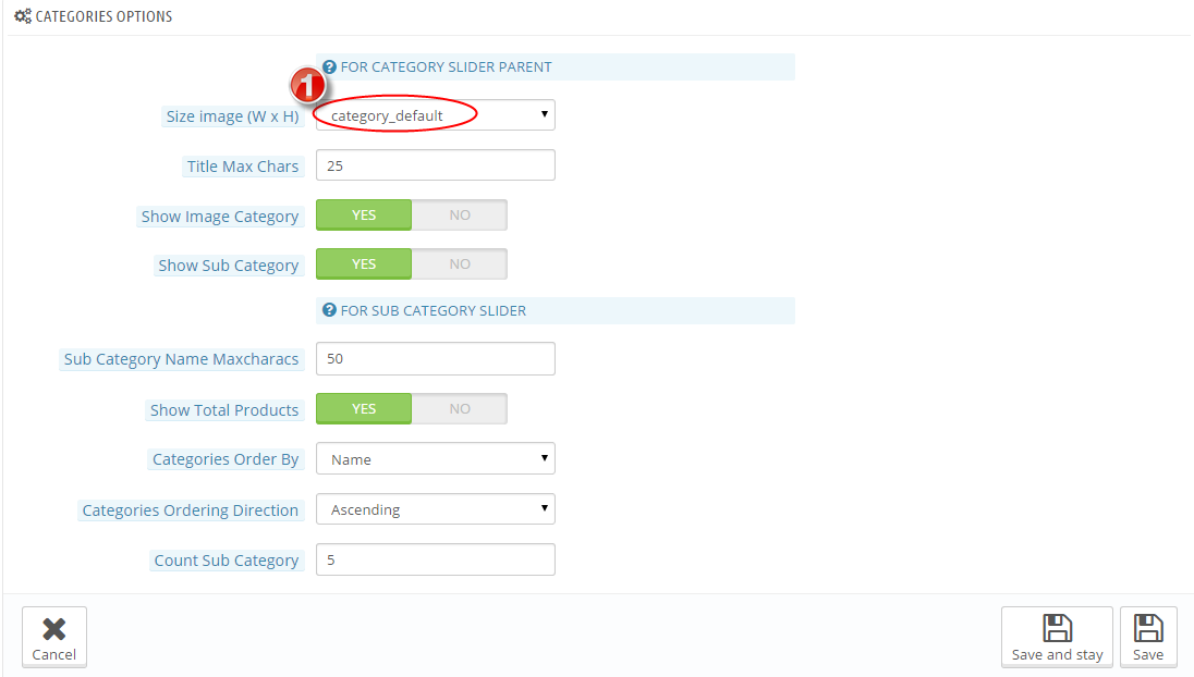
FOR CATEGORY SLIDER PARENT
- Size image (W x H) – Select Size of image in list box.
- Title Max Chars – Set the max characters of Category title. Input “0” to unlimited length.
- Show Image Category – Allow to show image category Or Not
- Show Sub Category – Allow to show Sub-category Or not
FOR SUB CATEGORY SLIDER
- Sub Category Name Maxcharacs – Allow to set the max characters of Sub Category. Input “0” to unlimited length.
- Show Total Products – Allow to show total products Or not
- Categories Ordering Direction – Allow to select direction that you would like Categories to be ordered by: Ascending/Descending
- Count Sub Category – Set the number Sub Category that will be show out
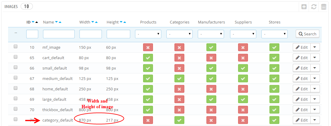
1. In Product Options part, The Size image (W x H) parameter is set “category_default”. To view the size of image, please go to PREFERENCES >> Images as the image below:
Product Options
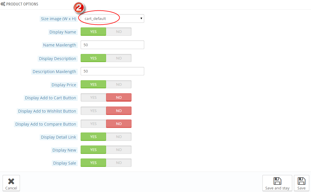
- Size image(WxH) – Select size of product image in list box.
- Display Name – Allow to display product name or not.
- Name Maxlength – The limited number of characters of product name.
- Display Description – Allow to display product description or not.
- Description Maxlength – Allow to set the max length of description can be showed. Choose “0” for showing full description.
- Display Price – Allow to display price or not.
- Display Add to Cart Button – Allow to display add to cart button or not.
- Display Add to Wishlist Button – Allow to display add to wishlist button or not.
- Display Add to Compare Button – Allow to display add to compare button or not.
- Display Detail Link – Allow to display detail link or not.
- Display New – Allow to show/hide “NEW” icon in product image..
- Display Sale – Allow to show/hide “SALE” icon in product image..
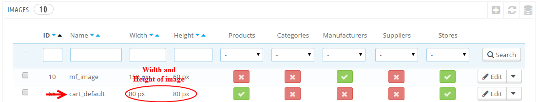
2. In Product Options part, The Size image (W x H) parameter is set “cart_default”. To view the size of image, please go to PREFERENCES >> Images as the image below:
Effect Options
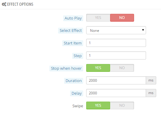
FOR ITEM PRODUCTS
- Auto Play – Allow to enable/disable auto play for slider.
- Select Effect – Allow to select the effect for the module in the list box.
- Start Item – Allow to set item that is displayed at first when you run slider.
- Step – Set the number of items for each slide transition.
- Stop when hover – Allow to pause effect when the user hovers.
- Duration – Determining how long the animation will run. Larger = Slower
- Delay – Allow to set a timer to delay the execution of the next item in the queue. Larger = Slower
- Swipe – Allow to run events swipe or not.
3 HOW TO CREATE CATEGORIES – Back to top
Please go Here to readmore How To Create Categories in Prestashop.
4 HOW TO CREATE PRODUCTS – Back to top
Please go Here to readmore How To Create Products in Prestashop.
5SUPPORT – Back to top
Thank you so much for purchasing this module. If you have any questions that are beyond the scope of this help file, please send us via: Support Tickets System
Thanks so much!